


![[Free Game Giveaway] Lost Records: Bloom and Rage for PlayStation 5 (NA)](https://www.gamerfeed.co.uk/wp-content/uploads/2025/04/Free-Game-Giveaway-Lost-Records-Bloom-and-Rage-for-PlayStation-360x180.jpg "[Free Game Giveaway] Lost Records: Bloom and Rage for PlayStation 5 (NA)")


")
: Potential Tariff Relief for XR Headsets, Vision Pro 2 Production News, and More!")


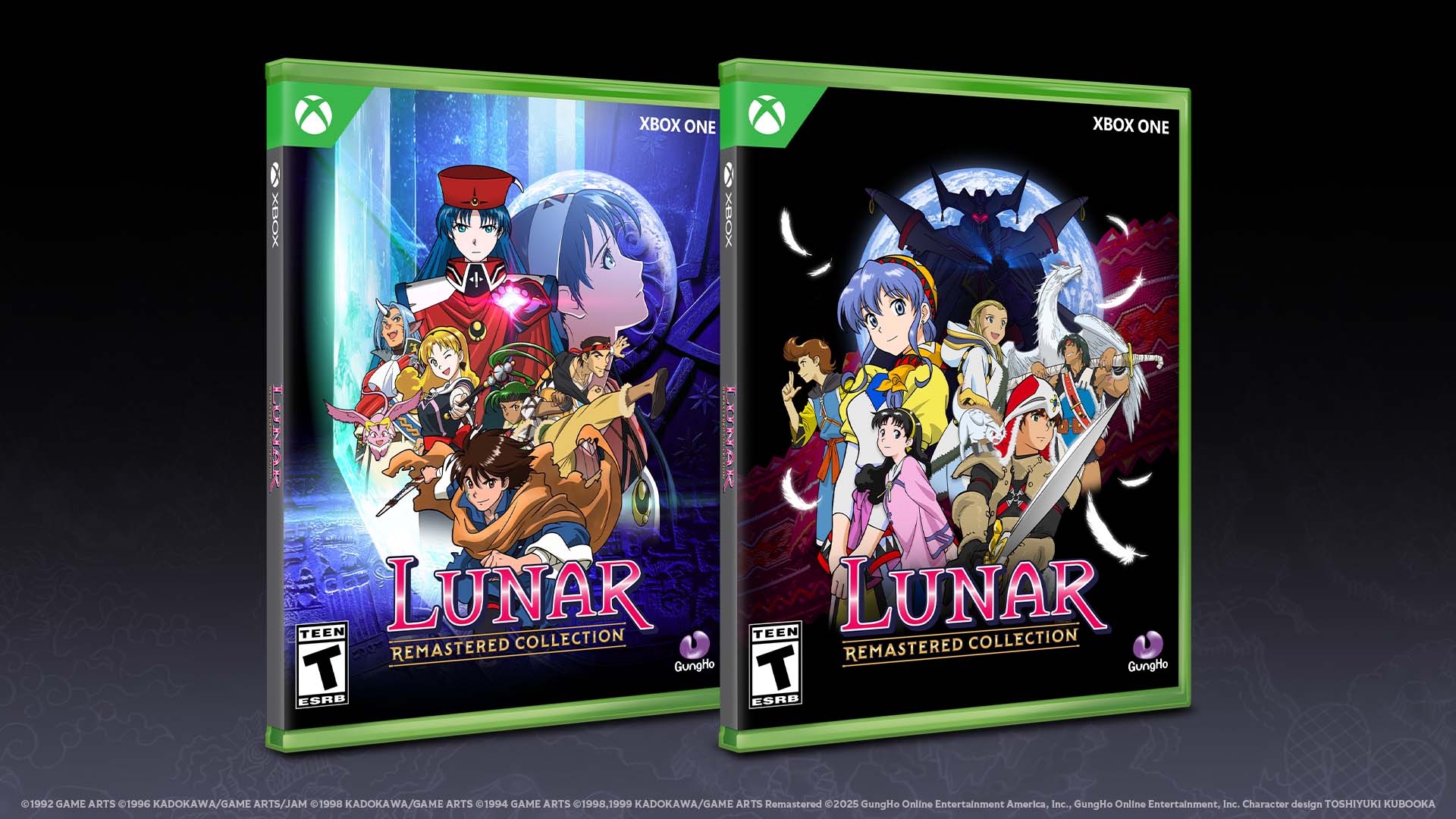
With the release of the Lunar Remastered Collection for Xbox One, which is also compatible with Xbox Series X|S, a journey of nostalgia meets modern design. To shed some light on the creative process behind this remastered collection’s branding, I had the pleasure of speaking with Amy Nguyen, the talented Senior Graphic Designer at GungHo America. We talked about her creative journey, inspirations, and the design elements that brought the new logo to life.
Hi Amy! Thanks for joining me. Could you share some of your experiences and notable projects at GungHo?
Hello there! I’ve had the opportunity to work on a diverse array of projects, ranging from designing assets for national tournaments of our games to exciting collaborations with top-tier IPs. My first major project as a creative lead was overseeing the console port of Grandia, set for release in 2024.
What was your initial reaction when tasked with designing the logo for Lunar Remastered?
Being asked to design the Lunar logo was both exhilarating and a bit intimidating. Knowing its significance to the game’s identity, I began by creating several variations. It was a dynamic process involving feedback loops to refine the concept until we arrived at the final design.
Could you walk us through how you balanced the original logos while crafting the new one?
I kicked things off with thorough research. Since the goal is to honor the original’s legacy, I wanted the design to resonate with what veteran players cherish about Lunar. This involved sketching numerous ideas, from minor tweaks to major design shifts. Ultimately, we settled on a design that integrates the iconic Lunar red with a modern twist of gold accents, reflecting the remastered nature of the games.
The logo underwent many iterations. Where did you draw your inspiration from?
The primary goal was retaining the nostalgic vibe of the original while infusing elements of the new remaster. Each sketch explored different directions—some focused on color, mixing hues from Lunar: Silver Star Story and Lunar 2: Eternal Blue, while others played with accents like the dragon sword or the ribbon from Lunar 2’s Sega CD logo. Variants of the font shapes were tested before the final merging of ideas resulted in our chosen design.
![]()
Are there any specific details in the final logo that you’re particularly proud of?
Absolutely! I’m quite fond of the extended tail in the ‘R’ of "Remastered," which echoes the original Lunar logo. Additionally, I enhanced some serifs on letters like R, E, and N in "Remastered Collection" to give the typography a refined and intriguing quality.
How did Toshiyuki Kubooka’s new key visuals influence your design for the packaging?
Mr. Kubooka’s work was stunning, adding a new depth with its darker, collaged composition. The key visual easily fit into our cover design, requiring minor adjustments for safety placements. His art informed not just the visual layout but also inspired the overall aesthetic of our packaging.
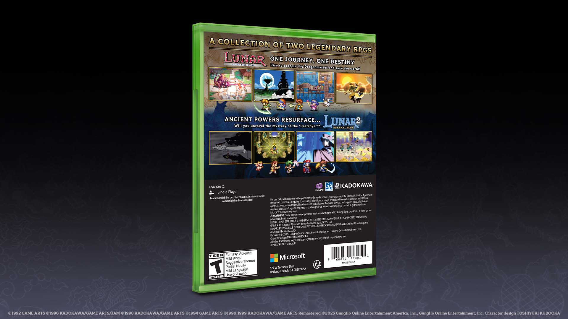
You had more freedom with the back cover design. How did you approach it?
I wanted to capture the nostalgia of pixel sprites, adding them alongside screenshots to portray the game’s essence. Design-wise, I kept elements coherent with the brand, incorporating the remastered logo’s gold accents and fonts. The gradient background distinguishes the two games yet unifies them as a collection.
What’s your favorite part of the package design?
Collaborating with Mr. Kubooka and integrating feedback from GungHo’s Marketing and Production teams, as well as input from original developer Game Arts, made the design process rewarding. This package represents a collective effort that I hope will delight fans new and old.
Lunar: Remastered Collection has officially launched on Xbox, offering an enriched experience of two timeless JRPGs. Dive deep into a world where vintage charm meets today’s enhancements for an unforgettable gaming journey.


